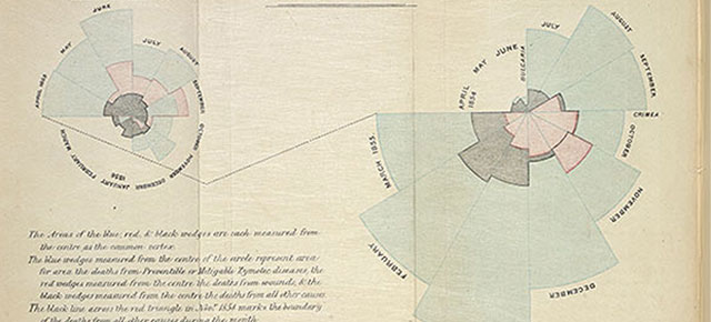

Infographics are very popular in these digital days, springing up across the internet to demonstrate everything from what we eat to what we watch. Often they are little more than statistics illustrated with pictures. But diagrams, the subject of Beautiful Science an exhibition at the British Library until 26th May 2014, can change lives. In her seminal ‘rose diagram’ (above), Florence Nightingale demonstrated that more soldiers died from preventable epidemic diseases (blue) during the Crimean War, than from battlefield wounds (red) or other causes (black), changing battlefield nursing forever. (Incidentally, ‘the lady with the lamp’ was also known as the ‘lady with the hammer’ after she smashed open a locked storeroom to access medicine for the soldiers!)

Epidemiologist and statistician William Farr plotted cycles of temperature and cholera deaths for 1840-50. He said that the circular form and colours made “the diagram represent the facts in a striking manner to the eye”. While his theory that cholera was spread by miasma or ‘bad air’ from the evaporation of the Thames proved to be incorrect (we now know it is caused by waterborne bacteria), he wasn’t far off and he left an important legacy – the first national system for collecting statistics, a data-driven approach to public health, and innovative graphic methods to communicate that data.

It was fascinating to see how close to reality documentation got with such limited technology. Above is Robert Fitzroy’s illustration showing how storms and cyclones develop on the border between warm tropical and cold polar air masses. Fitzroy is best known as the captain of HMS Beagle aboard which Charles Darwin sailed as a naturalist, and is widely considered to be the grandfather of the modern weather service. This image looks remarkably like a modern satellite image.
The exhibition is worth checking out if you’re interested in graphic design, or simply how to present information in a more visual way, if only for the captivating animation by NASA (pictured below), visualising the flow of ocean surface currents from June 2005 to December 2007.

Further reading for the especially geeky:
- out and about :: in the making (pt 2)
- out and about :: hello, my name is paul smith
- out and about :: greenhouse, stockholm furniture fair
- out and about :: in the making (pt 1)