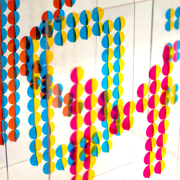

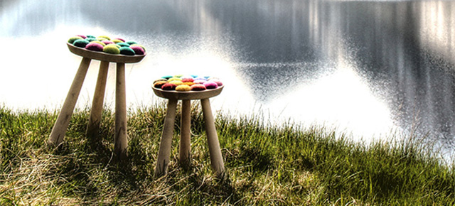
I was recently invited to join the judging panel for the 2015 Dulux Let’s Colour awards and to nominate two new rising stars I thought were worthy of recognition in the newly created “Young Designer” category. I nominated Zoe Tynan-Campbell’s Hasbeens, and Meggan Johnson’s Dots Project. (Winners are announced on 27.04.15 so watch this space.) As someone who is only just starting to gain confidence with colour, the experience got me thinking – why is colour so important, and why are we so scared of it?
“When we take in colour through our eyes it passes through the same part of the brain as our emotions,” applied colour psychology expert Karen Haller told me. “And when this happens, colour stops being purely visual and starts to become emotional. When we see colours, they send unconscious messages in a language that we understand instinctively – the language of emotions.”
Editor of colour-inspired blog Bright Bazaar Will Taylor agrees: “Colour is a visual trigger that we respond to in both our conscious and sub-conscious decisions,” he says. “We make colour-based decisions throughout day-to-day life without necessarily realising it – the packaging we gravitate towards in the grocery store, or the adverts that catch our eye as we flick through a magazine. There are also times when we make more conscious colour decisions and both scenarios are what make up our memories and therefore impact upon the emotional attachment we have to certain colours. When we choose a bunch of flowers, or the colour of a new sofa, we do so because we feel an affinity with that hue – it’s a source of happiness or comfort.”
Designer Henrik Ilfeldt uses colour in his work to bring positive feelings into people’s homes. “Functionality appeals to your mind, and simplicity to your aesthetic sense, but colour speaks to your heart,” he says. “Often you cannot explain why you love a certain colour combination – it’s just a feeling. My work is very cheerful. I aim to light up a room with small home accessories. I love to mix materials, shapes and colours and I absolutely love it when people feel the urge to touch the products and explore them. Colour stimulates curiosity.”
So if colour is so important, and makes us so happy, why are we so afraid of it? My mother was horrified when I told her I’d painted my entire house in various shades of grey, but to me it’s a Scandi-inspired, understated dream. It’s calm and quiet, and if I’m honest, difficult to get wrong. Am I just making excuses for my lack of colour courage? If I am, it would seem I’m not alone. Research (admittedly carried out by Dulux) has found that more than half of Britons would like to use more colour in all aspects of life, but were worried about what friends and family might think. 21{ff546b69e23b1524d799f96c6ba7a638e1f677053b0a2a1568b05315fd5f8fc7} also said that they aren’t confident enough to use bright colour in any aspect of their lives because they are reluctant to stand out. The saddest findings of all were that 44{ff546b69e23b1524d799f96c6ba7a638e1f677053b0a2a1568b05315fd5f8fc7} of people questioned still love their childhood favourite colour, but shy away from using it in their adult lives.
“We all experience sensory overload in our lives and the first thing we do when everything gets too loud is switch things off,” Dulux creative director Marianne Shillingford explained. “Sadly one of the stimulating things that often gets turned off is colour. Initially, the lack of colour instils a visual quiet but before long it acts like a tranquilizer and makes us feel disconnected from the world. Everyone needs to express themselves – and this desire begins with colour. It makes me sad that we have allowed colour to slip from our lives and it’s my mission to prove that it has the power to restore calm, and reenergise. I know from many years of experience that adding colour to people’s lives makes us all much happier.”
British people associate certain colours with certain eras and it seems we’re getting duller by the decade. We associate the 1960s with sunshine yellow, the 1970s with purple and the 1980s with electric blue – but the most popular colours of the 1990s, 2000s and 2010s have been sand, grey and black respectively – and respondents predicated the most popular colours in the future will be silver, white and grey.
What’s so wrong with that? “Colour is one of the fundamental building blocks of life,” says Marianne. “It is an essential vehicle for non-verbal human communication and expression. It helps us make sense of the world in terms of identifying what is good to eat, good to wear, good to touch. Colour defines the seasons and balances our metabolic clocks – we know that spring is here when we see yellow flowers and pastel blossom and that winter is approaching as the leaves turn a million shades of copper and gold. We are warned and excited by red and soothed by pastoral greens. We smile at clean bright colours and reach out to touch velvety shades of violet and grey. The world would look dead, taste of nothing and feel lifeless without colour”.
I asked Will for some advice on how to get braver with colour. “Start small,” he said, instantly reassuring the colour-phobics amongst us. “Pick a hero piece as your point of reference to create a colour focus. This could be a piece of furniture, a rug, an artwork, or a vase. Use this one piece as your reference point for the colour scheme as you begin to layer other pieces into the space. If you’re keen to paint with brighter colours but are nervous, why not try introducing a bold hue to a brightly painted skirting board? This will provide an unexpected dash of a stylish hue in the room, but as it’s a much smaller surface area than a whole wall, it will feel less intrusive to those who are colour shy. Surrounding yourself with colours that evoke positive memories leads to more personalised and happier homes.” And with 46{ff546b69e23b1524d799f96c6ba7a638e1f677053b0a2a1568b05315fd5f8fc7} of people saying they feel happier in a brightly decorated room, perhaps he’s right.
“My top tip is to trust your own instincts,” adds Karen. “Start experimenting with the colours you love, the ones that bring happiness, joy or whatever you want to feel. Then you can bring those colours into your home – accessories or even a bunch of flowers might be all you need. By starting to embrace the colours you love, your confidence will soar. Colour is fun and inspiring. The most important thing to remember is colour isn’t permanent, so if it doesn’t feel right the first time, play around with the tones, the proportions or the placement until it feels right for you – until it feels like home… your home.”
Right, I’m off to replace some of that grey with my childhood favourite colour – grass green. Wish me luck!
Further reading for the especially geeky:
- pinterest :: red
- out and about :: twelve at stockholm furniture fair 2015
- out and about :: ambiente frankfurt
- out and about :: greenhouse, sff15

Image: Meggan Johnson’s Dots Project

What an amazing article! I totally agree with everything said. It’s so easy to think ‘I’ll go with grey’. When we moved into our house we were donated lots of brown furniture so we needed to inject colour to balance it out, it’s taken us a whole year to decide what colours to choose. I have a green Notknot cushion and a pink House of Rym blanket. These colours helped us to choose pale greens and pinks. The house has come alive and become our own, from starting small and taking our time to decide.
Congratulations Antonia – it sounds fantastic! I’m still taking baby-steps with mine! A few yellow accessories so far!