I still can’t quite believe I have met and interviewed the man behind the “work hard and be nice to people” poster that adorns so many design studio walls and provides daily inspiration for the design community and beyond.

Arguably the driving force behind the current appreciation for typography; you might describe Anthony Burrill as a designer’s designer. I am delighted to confirm that he can also be described as a jolly nice chap – he is very modest, seems quite shy; and is every bit as lovely and positive as his optimistic artworks imply.

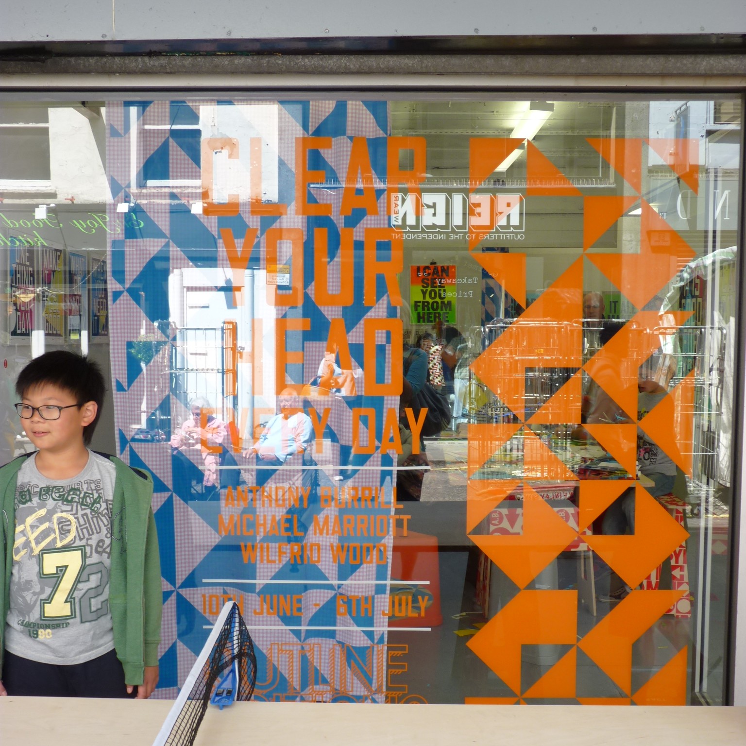
I was lucky enough to be invited along to the private view of his new show, in collaboration with fellow graphic artists Michael Marriott and Wilfred Wood, at Outline Editions on Berwick Street in London – and to a graphic design workshop with Anthony held there two days later.
Here’s what he had to say…
What’s the most important thing to know about you?
The most important thing to know about me is that I prefer crunchy peanut butter to smooth.

Why do you think typography-led design is such a big trend at the moment?
Words are very immediate; people respond instantly to a piece of text. Everybody is looking for clues about how to live and how to be happy. I try to send out positive, genuine messages that I’ve learnt from my experiences so far.
What inspires your slogans?
They pop in to my head when I’m not thinking about them I try to remember the good ones.

Where did “work hard and be nice to people” come from?
I overheard the phrase being spoken by an elderly lady in the queue at the local supermarket it immediately struck me as being profound in its simplicity and truth.
I didn’t suspect for a moment that it would become such an important part of my work.
Why is your (beautiful) blog in black and white when your work is so colourful?
The blog is more about things I’ve seen, or work in progress. It feels more like a scrap-book or sketch book, so it seemed like a nice approach to make it black and white. Plus it looks really cool!
Your work is very optimistic – where does this sense of optimism come from – and how do you maintain it?
I was brought up to have a positive outlook, my parents worked very hard and always enjoyed themselves in the world that they had created for themselves.
I’m lucky enough to have a lovely wife, beautiful children and have fun for a living, that’s how I maintain my optimism!

You’re most well-known for your graphic design work – are you keen to do more film work or 3D design? Which medium is your favourite?
I like to explore lots of different avenues with my work and I collaborate with some very talented people. I think the key is to have a real variety in your work and your life. I haven’t got a favourite medium; I enjoy it all equally. At a push I would say that print is the most satisfying – I like to make things that you can touch and hold.

How does living and working on the Isle of Oxney affect your work?
I live in a small village in a rural area of Kent. The pace of life is relaxed, and this suits me perfectly. I like to have time and space to think. I travel lots with my work, so I get to have my dose of city life, but I’m always happy to return home so I can walk my dog through the fields and feel the nature and peace.
What advice would you give to up-and-coming designers?
Make work you believe in.

What single item that you’ve produced are you most proud of?
It has to be the ‘work hard…’ poster. I’m continually pleased with its popularity, and the way that it has travelled outside the world of ‘graphic design.’
What’s next for you?
My new show Clear Your Head Every Day is at Outline Editions until 16th July. I’ve produced lots of new work for the show, alongside collaborations with Michael Marriott and Wilfred Wood that I’m excited to share with people.
After that I’m off to Barcelona for a summer workshop in July, a project for Amnesty and another exhibition in Istanbul in September.
What’s your favourite colour?
It’s hard to choose, but I use red a lot in my work, so it would have to be that.

Clear Your Head Every Day is at Outline Editions until 16th July, and I would definitely recommend popping along if you can. And watch this space to see what I made at the graphic design workshop – I’ll be posting that in two weeks’ time.
You may also be interested in:
- interview :: experimental jetset
- interview :: wim crouwel
- interview :: john miller and anna hart
- interview :: helen lang
- https://www.facebook.com/media/set/?set=a.194353333946741.42394.181947435187331 (more pictures)
- http://www.anthonyburrill.com/blog/ (Anthony Burrill’s gorgeous blog, from where you can also access his website)
- http://www.outline-editions.co.uk/ (Outline Editions)
- http://www.pointsize.com/2011/06/19/anthony-burrill/ (Post from Point Size featuring my favourite print)
- http://www.fadwebsite.com/2011/06/10/reviewanthony-burrill-at-outline-editions/ (Fab review of private view)
- http://www.artatheart.co.uk/artatheart/2011/04/anthony-burrills-lovely-prints.html (Art at Heart post about Anthony Burrill)
- http://blog.artsthread.com/2011/03/pick-me-up-interview-with-anthony-burrill/ (Arts Thread interview with Anthony Burrill)