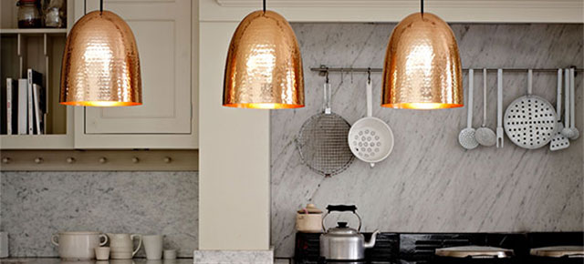

Tom Dixon has been using bronze, copper and brass since he launched his eponymous brand in 2002, but it seems the rest of the design world has taken a little while to catch on. Finally, these ‘warm metallics’ are everywhere. Bronze, copper and brass bring a touch of understated luxury to anything they touch. It might seem inappropriate in these austere times to appear too indulgent, but we all need a little bit of luxury, and that’s where these metal finishes come in. Warm metallics work particularly well with dark or neutral schemes where they can look quite Scandinavian, or combined with an industrial aesthetic to create a contrasting ‘rough luxe’ look.

Copper has of course been used in the building trade for centuries. It weathers to a beautiful blue-green patina when exposed to the elements, but is currently being used in its highly polished form, when it has a warm pinky-orange colour with a reflective surface. Brass and bronze are both derivatives of copper.

Hand-spun in Birmingham, the Original BTC England’s Stanley pendant has a solid brass shade with a hammered finish. Peter Bowles, Founder and MD said: “For a long time, these metals were in the design wilderness. The resurgence of brass, copper and bronze is a direct response to our fatigue with plastics and other mass-produced materials.”

Hunting & Narud’s Copper Mirror Series for Gallery Libby Sellers (where it will be until December 14th) was designed to showcase the materials it was made of and did that with aplomb. Amy and Oscar said: “We are drawn to all natural, raw materials. Hopefully copper isn’t just a passing trend – people seem to be really drawn to it: its warmth and beauty, and its fragility too. Copper needs to be looked after, which we really enjoy the idea of.”

Lars Beller Fjetland’s Cloche lamp features an elegant highly-polished copper shade. Sven Ivar Dysthe’s Butterfly Copper lights for Northern Lighting and Epaulette by Ida Noemi and Caroline Olsoon provide further examples of Scandinavian designers embracing this trend. Caroline said: “The Epaulette frame is a minimalistic product; by using copper we were able to just highlight the corners in a more exclusive way.”

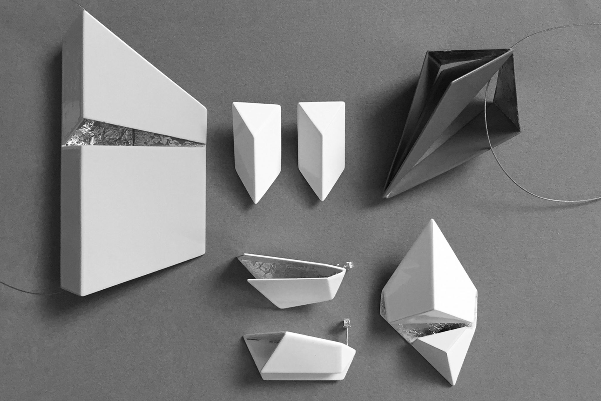
The lids of BRINK graduate Carolina Peraca’s Marbled Boxes are made of copper and brass, offsetting the pale, delicate porcelain perfectly. Carolina said: “I wanted to use metal for its reflective properties, but not stainless steel – it’s too cold and traditional. Copper and brass are much warmer – their gold colours remind me of beautiful summer sunsets.”

M-DEX’s mirrors feature a subtle copper detail, which lift the design into the extraordinary. Designer Miles Dexter said: “Copper is a fantastic material – it’s versatile, durable, decorative, soft, subtle… Its appearance can be changed by oxidisation, or preserved by using a lacquer. Copper is all around us every day – there are so many uses for it, seen or unseen.”

Rosanne Bannister‘s concrete containers feature copper and brass lids decorated to mimic manhole covers. She said: “I love the brightness and vibrancy of brass and copper.” Alex Price’s Bottle Candleholders are cast in aluminium and plated in gold, copper and nickel, while Rosa Cobrisa’s Table Art comprised three copper trays inspired by the thin wooden boats used to promote the exchange of flowers in fruit in ancient Mexico.

Vibeke Skar has recently launched a copper version of Everygreen, a lamp for Northern Lighting, previously available in glass. She said: “Copper is genuine, natural, warm, atmospheric, industrial, rough, elegant and pretty – what’s not to like?!”

Meanwhile, HAM has deviated from its previously monochrome colour palette for the first time to preview a rose copper foil blocked limited-edition print in aid Maggie’s, which will be launched in March – and Lovely Pigeon has launched a stationery range embellished with copper. Lovely Pigeon’s Kirsty Thomas said: “I think using warm metallics in their raw state has a truth and simplicity that you don’t always get from other materials.
“I really like the combination of these warmer metallics with my usual palette of washed out pastels and solid blues and greys. This year’s collection was inspired by the geometry of local harbours – sunsets, reflections, and the shapes and structures of boats, masts and sails. I’ve broken these seascapes down to their most simple geometric forms and the copper foil gives the impression of reflections in the water.”
What an outpouring of love for copper! It seems Tom Dixon had it right all along. He was just 11 years ahead of his time.

Further reading for the especially geeky:

Copper is a beautiful material, especially how it reflects light. I’m sure we’ll be seing a lot more copper lamps and decorations in the future.