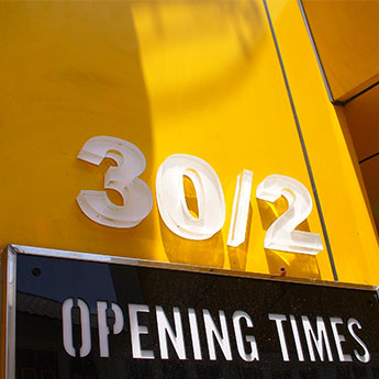
From last week’s colourful selection of numbers to quite a monochromatic palette this week. Top and bottom, 20a and 20 – 22, were clearly spotted in close proximity to one another! I love the typeface and “to” versus “two” in the latter.

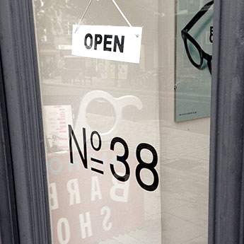
In the middle, No 38 with that double underlined “o” is precise and slightly geeky – perfect for the optician’s door I spotted it on in central London.
Have a great weekend folks.