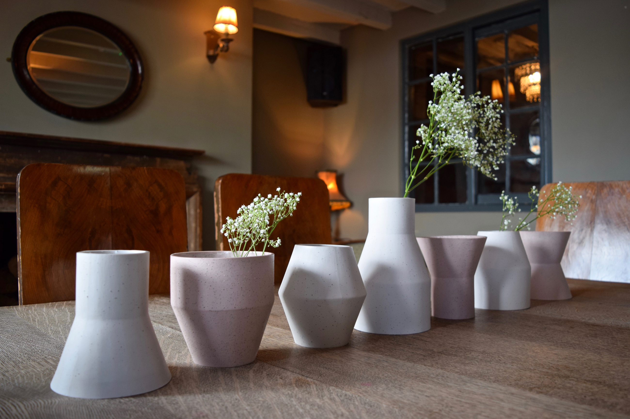

The final forms each incorporate a strong angle sitting either inwards or outwards, allowing multiple pieces to sit together in pairs or sets. The considered proportions, each with the same datum line, highlight the geometry further. The controlled, minimal aesthetic is off-set by the soft pastel shades Holly has used to present the collection, but the final shapes and colours weren’t her starting point.

“The collection actually began through experimenting with the methods used to create texture within the clay’s surface,” Holly tells Design Geek. “It was only when I united that research with my love of minimalism and industrial forms, that I developed the shapes and colours.”

Taking inspiration from marble and terrazzo – a flooring material consisting of chips of marble or granite set in concrete and polished to give a smooth surface – Holly played with various methods to produce the textures, grinding down different materials including rust and aquarium gravel, before adding them to the clay.

Testing these methods was a meticulous process that allowed Holly to challenge the more traditional approaches to ceramic design and develop her signature style. She developed her textural exploration over the course of her final year, and in fact showed the results of her experiments as the back-drop to her degree show. The subtle textures add another layer of interest to the collection, contrasting the stark forms themselves.
“The project revolved around the textural experiments as my initial aim was to compare a range of different body additions to see the altered effects they would have on the clay.” she explains.

With a nod to Memphis Group of the early 1980s and specifically the work of architect Ettore Sottsass, Holly has always had an interest in industrial aesthetics. As well as experimenting with ceramics, texture and tone, she also played with the inclusion of other materials in some of the earlier iterations of the collection, using a contrasting band of metal to off-set the matte ceramic finish.

Her playful approach to experimentation in her designs and inspiration has created a strong, three-dimensional graphic collection with the use of texture and tone showcasing a modern, forward-thinking body of work – something she is keen to continue with an MA in Ceramic Design starting in Stoke-on-Trent in September.

Since showcasing her collection at New Designers in June 2016, Holly has been invited to showcase her work at Lustre in Nottingham, which highlights some of the best contemporary craft in the UK. Holly will be part of the Young Meteors Scheme celebrating graduate and new designers which takes place on the 12-13 November.

Holly Kemp is one of Look Like Love’s ‘One-to-Watch’ designers, find out more about her work here.