I popped into the V&A last week to see the Jameel Prize exhibition. Awarded every two years, the Jameel Prize is a £25,000 international art prize for contemporary artists and designers inspired by traditional Islamic art, craft and design. The film above is a short excerpt of an absolutely captivating video installation by Mounir Fatmi, just outside the entrance. It’s called Technologia “a metaphor for the contemporary world” and connects traditional wheel shaped calligraphic compositions of Arabic texts with Marchel Duchamp’s Rotoreliefs – the earliest form of kinetic art. Another video installation inside the exhibition by the same artist, Modern Times: A History of the Machine, uses the same circular arrangements of calligraphy as the wheels of a noisy train hurtling forward relentlessly.
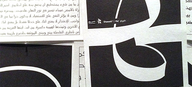
I loved Nada Debs’ Concrete Carpet, which has 28 panels, one for each letter of the Arabic alphabet. The typeface was designed in collaboration with Pascal Zoghbi, also shortlisted for the prize. Faig Ahmed’s two works Hollow and Pixelate Tradition are based on Azerbaijan’s ancient craft of carpet making. Both are made by hand using traditional techniques and follow the traditional design, until the point at which he subverts it, making one rug seem as if it’s falling into a hole and the other as if it’s pixelated. Being a fan of typography, it was the calligraphy that really caught my attention and I think Nasser Al Salem’s Kul was my favourite piece. It uses the combination of the letters ‘kaf’ and ‘lam’, which together spell ‘kull’ meaning ‘all’. He repeats the word on an ever diminishing scale suggesting infinity and all-inclusiveness. More typography from Pascal Zoghbi’s Beirut-based design studio 29Letters and a site specific installation dramatising the recent explosion in typefaces, which must meet modern requirements while staying true to the conventions of Arabic script. And finally, the winning design is Istanbul Contrast, a collection inspired by robes worn by the city’s Ottoman rulers and its architecture, designed by Turkish fashion label Dice Kayek, founded by sisters Ece and Ayşe Ege. If you’re not familiar with Islamic art and design, and even if you are, I highly recommend a look. The exhibition is at the V&A until 21st April 2014. Admission is free.

Further reading for the especially geeky:
- out and about :: in the making (pt 2)
- out and about :: hello, my name is paul smith
- out and about :: greenhouse, stockholm furniture fair
- out and about :: in the making (pt 1)

Hi Katie The exhibition looks great! I’m going next week and can’t wait to see it. I love Arabic art and calligraphy and am also so pleased that Nada Debs was shortlisted for the Prize as I really admire her work and design aesthetic and am so proud to be carrying some of her pieces! Initiatives like the Jameel Prize are so valuable in encouraging and boosting the wonderful creativity from this part of the world.