
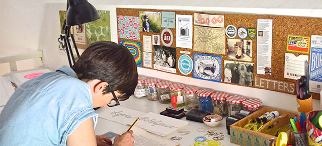

Justine Wall aka Hector & Haddock has a studio in her 1650s thatched cottage on Salisbury Plain, from where she creates linocut, letterpress and screen print designs inspired by, and often incorporating, paper ephemera and traditional printing methods. She describes her cottage as looking “like it’s been iced with Royal Icing and topped with Shredded Wheat.” I had to take a look…

“I love working here. I like how the age of the house and my work fit together: everything I make is either hand-cut from original vintage paper or, in the case of my screen prints, linocuts and cards, inspired by the vintage texts I collect, ” Justine told me. “The studio is piled high with hundreds of thousands of paper pieces, and I’m still collecting more. The smallest thing can inspire a piece, whether it’s a GPO telegram stamp, to the typeface on a Borax box, I take inspiration from the past and design pieces which I feel honour the graphic simplicity of times gone by. I purposely retain a handmade feel to everything – even though the linocut designs go through a vectorising process to supersize them for my screen prints, I want there to be imperfections, to remind the viewer that the design was cut by hand.
“I purposely do not make copies of any of my hand cut pieces: each piece is a one-off and I do not want to replicate it. Even the screen prints are limited edition, so are finite, and the linocut designs change all the time. I design what inspires me at the time, and what makes me happy, and I am the first to admit I am not swayed by the vagaries of the press or what trends demand!
“I draw in black fine liner and colour in with Posca pens, which I’m obsessed with. I stick a lot of my favourite pieces of ephemera on my walls as there’s no point in it being stuck away in boxes. The Go West is cut from an original Roy Rogers Annual, and I found the Ladybird Football images in a tip! The old jam jars are filled with postage stamps, paper letters, and my Perspex smaller alphabet stencils.
“I have a bit of a thing for South Pacific Album covers, small animals, correct punctuation, and London Underground Commemorative maps. The curve of the walls echoes the thatch curves above it, I have to duck a bit in places, but I make sure every corner is used and filled with paper, maps, and tea towels.
“The only lasercutting allowed in the studio are my beloved Perspex stencils – I use four different sizes, and two different fonts: a Gill Sans and Constantia.”
Further reading for the especially geeky:
- creative spaces :: tom raffield
- creative spaces :: sebastian cox
- creative spaces :: rebecca hoyes
- creative spaces :: studio dempsey
Further eye candy for the especially visual:
There are photos of this space and lots more creative spaces on the confessions of a design geek Pinterest page. If you’re not a member yet, click here to join.

I love this! I am in all honesty a sucker for pictures of other creative’s work spaces 🙂
http://www.misadventuro.us